Design Challenge Context
This Design Apprenticeship Program is organized by Columbia College and the Google UX Design Team in New York.
The program aims to use and promote Google’s technologies to improve students’ on-campus life experience and wellbeing. The current Columbia Mental Health portal is hard to use, since users are struggling with seeking for doctor appointments, in-network providers, and event resources.
Our Selected Team prompt is…….
How could we create a better digital App experience to improve the mental wellbeing of Columbia students by incorporating Google products?
My Role
UI UX Designer
Team Lead
Duration
12 Weeks
Feb 2023 - May 2023
Tools
Figma, Adobe Photoshop,
Google Forms, Canva
Team
Mentors from Google New York
Mona Wang, Mia Liu, Joey Lee


Design Thinking Process
Our design process followed the Design Thinking framework, the iterative and user-centered methodology guided our process through five key phases: Empathize, Define, Ideate, Prototype, and Test. This approach allowed us to deeply understand user needs, clearly articulate the core problem, generate innovative solutions, and continuously refine the features through feedback and iteration.
What UX Research We Did?
During the research phase, we conducted user personas, interviews, Google Form surveys, storyboard, and user journey mapping. Through this process, we discovered that college students are frustrated by inefficient digital booking experiences and are often unaware of how to fully utilize their mental health insurance plans and access educational events.
User Interviews + Google Form Surveys
User Journey Mapping
Through user journey mapping and storyboard, we discovered that the doctor appointment process is complex. Users are required to repeatedly input the medical information, highlighting an opportunity to simplify onboarding through a one-time health data submission. Additionally, the current booking system lacks clear information on how to find in-network providers covered by the college insurance plan. This gap presents a potential opportunity to leverage Google technologies to improve the current limitations.
Storyboard
Problem Statement
We identified that students face challenges accessing mental health support due to a confusing appointment system, difficulty locating in-network providers, lack of event resources, and inefficient process of logging in digital health data.
Design Solution
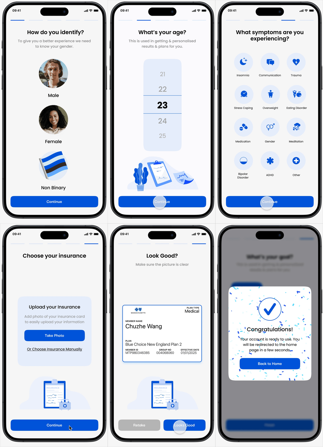
We created a student-focused mental health app with four key features: easy appointment booking, in-network provider map search, a digital log-in data profile for storing medical documents, and an event guide for mental health resources—all designed to simplify access and support.
1. Streamlined onboarding experience
This solution streamlines the onboarding experience for students by eliminating repetitive and time-consuming paperwork. Instead of filling out the same medical forms multiple times, users can submit once their information and securely store it in their health profile.
The flow also allows students to save and access their digital medical card, making it easy to manage health records and prepare for appointments—all in one centralized, student-friendly App.
2. Simplified Appointment Booking
The appointment feature allows students to filter providers by language, gender, rating, price, and specialty, helping them find the right fit with ease.
Integrated with Google Maps, the interface shows nearby in-network doctors in both list and map views. By digitizing the process, we removed unnecessary steps and made booking appointments faster and more accessible for students.
3. Integrated Google Map Navigation & Calendar Scheduling
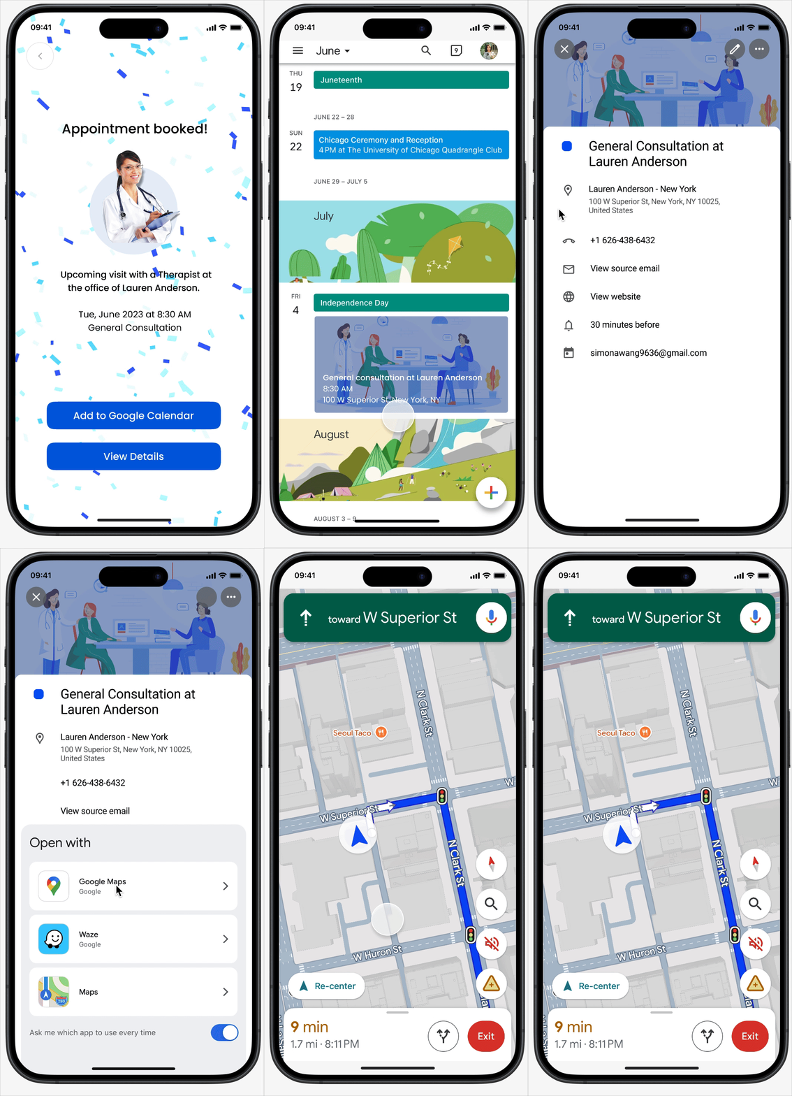
To support a smoother care experience, we integrated Google Calendar and Google Maps into the appointment flow. Once a student books an appointment, the details automatically sync to their calendar, helping them stay organized and avoid missed visits. With Google Maps built into the interface, students can easily view the doctor’s location and get directions with a single tap—making both scheduling and navigation seamless.
4. Stay Connected to Mental Wellness Events
To make it easier for students to access mental health resources, I designed a seamless “Add to Google Calendar” feature that integrates directly with each event listing. Students can browse upcoming wellness workshops, learning resources, support groups, or mindfulness sessions and instantly save events to their own calendar with one click—reducing barriers to participation and helping them stay engaged with support opportunities.
Ideation
After defining the user and product pain points, we figure out possible design solutions in the ideation phase. Aiming to incorporate Google technologies in our App to empower the Columbia student community, we conducted product research and selected Google Maps and Google Calendar. In this phase, our team went through the card-sorting, brainstorming sketches of the interface, user-flow exploration, and information architecture of the App.
Card Sorting
Sketch Brainstorming
Information Architecture
Prototypes
In the prototyping phase, we evolved the initial low-fidelity wireframes into high-fidelity interactive prototypes using Figma, employing a systematic step-by-step approach. Our guiding visual principle was the iconic Columbia Blue, seamlessly weaving it into the entire user experience to establish a consistent visual identity. Every visual element adhered to the design system, ensuring cohesiveness and precision throughout the process.
Wireframes
High-fidelity Prototypes
Success UX Metrics
After redesigning the Columbia Health App, we launched the demo prototypes to conduct usability test, including user interviews, time-tracking. We tracked key success metrics to evaluate how well the new features supported student engagement and reduced friction in accessing mental health resources.
✅ Streamlined Onboarding Experience
Goal: Help students feel informed from the first tap and reduce repetitive health data log-in.
Results:
🕐 Average onboarding time reduced from 10 → 5 minutes
🧭 92% of users completed onboarding without external help
❤️ New users reported feeling “guided,” “less anxious,” and “in control” from the qualitative feedback.
✅ Improved Doctor Appointment Booking Experience
Goal: Reduce friction in scheduling mental health care
Results:
📅 80% of students are satisfied with the appointment bookings after redesign
🔍 75% of students feel the filters are user-friendly and intuitive to meet the emotional needs (e.g. language and ratings)
🔒 87% said they felt “more efficient” locating health insurance in-network doctors.
✅ Stay Connected to Wellness Events
Goal: Make recurring mental health event and learning resources more visible and accessible
Results:
🔄 Recurring event attendance rose by 35% in two weeks
🧘♀️ Students cited the calendar integration and reminders as top reasons for attending
🌟 Self-reported mood improvement after event sign-ups and find the sense of community belongings.


