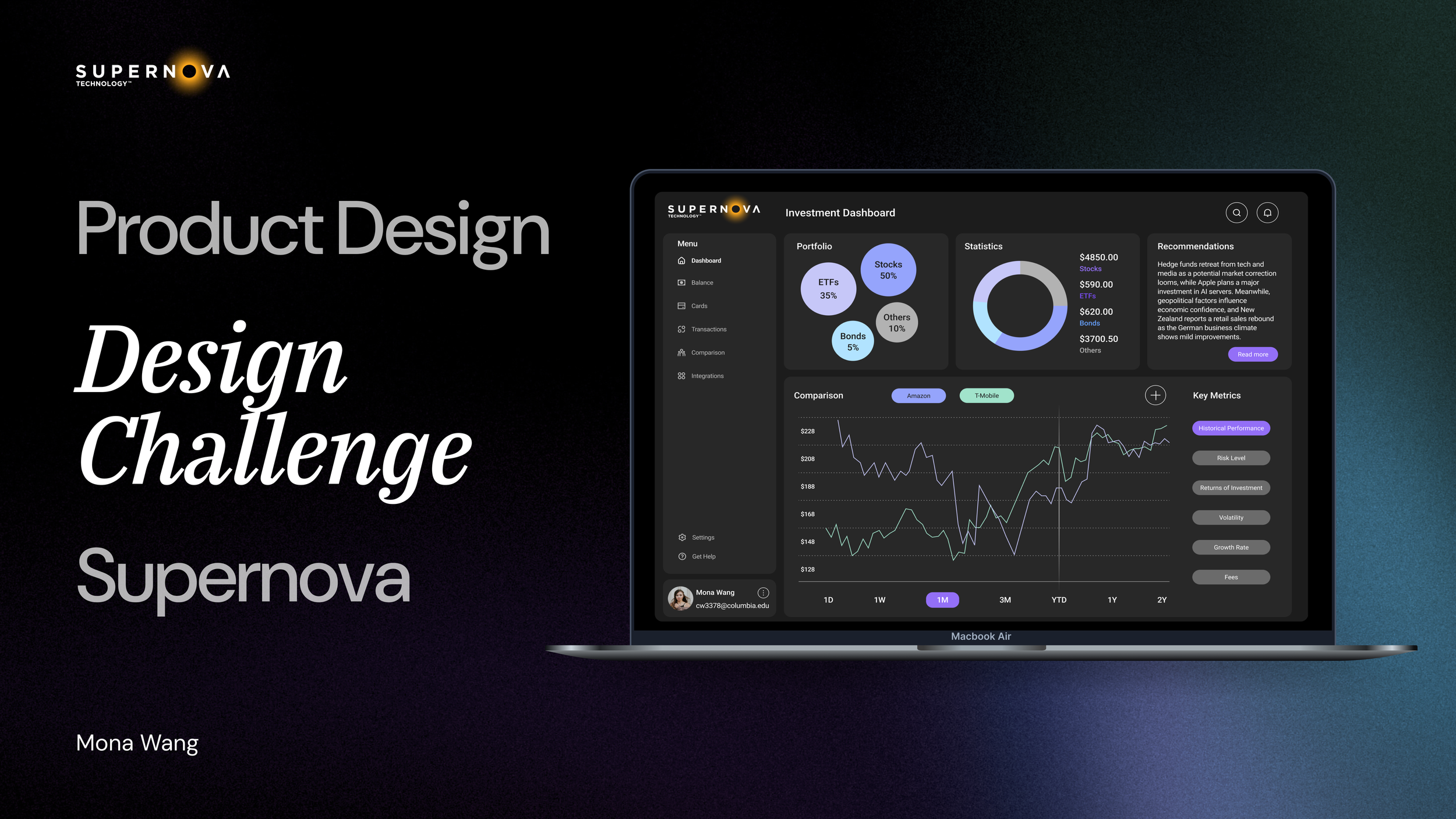
💡📊📈 Fintech Design Challenge
The design challenge prompt is:
How might we design a web-based comparison tool that helps users easily compare and choose between different investment options based on key metrics and preferences?
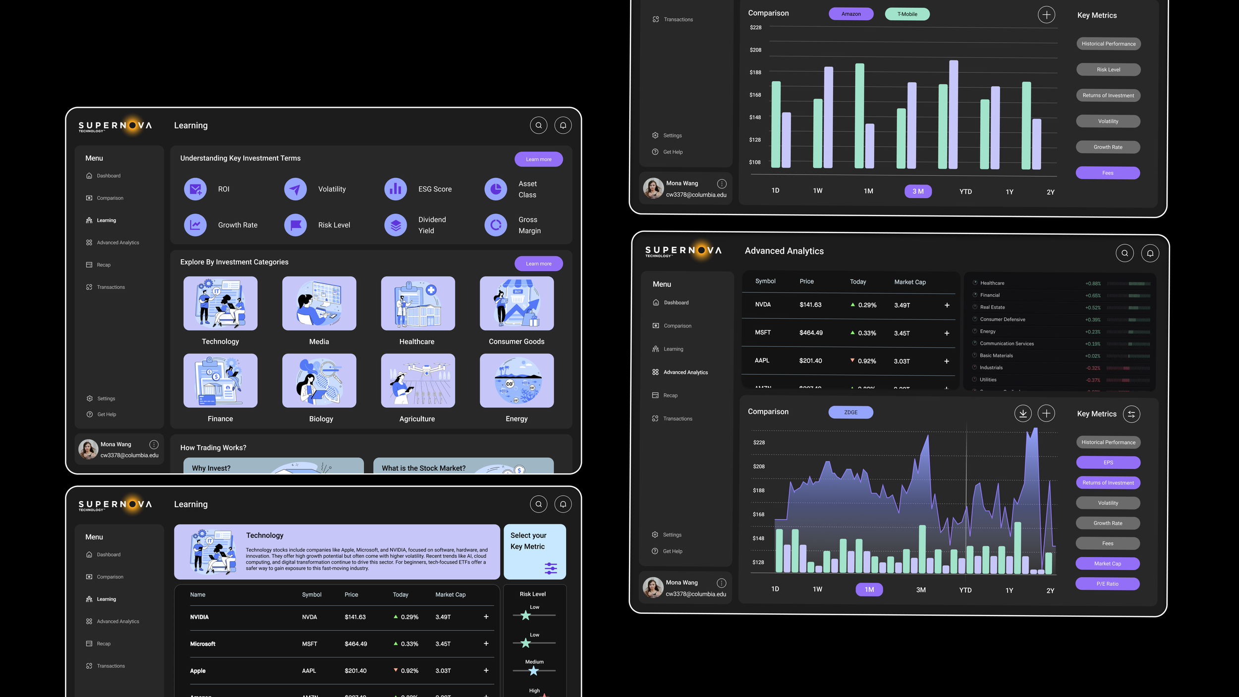
I was tasked with creating a responsive web-based dashboard that empowers both novice and expert investors to compare and evaluate financial products—like ETFs, stocks, and bonds—based on performance, risk, and return data.
Designed an intuitive and scalable interface that helps users analyze investment options with confidence. My goal was to balance data complexity with emotional clarity, ensuring the experience felt both powerful and approachable.
🛠️ My Contributions:
User persona - conducted clear and thorough user persona for two target user groups.
Information Architecture - Designed clear and logical information architecture aligned with user goals.
Wireframes - 20+ interface wireframe drawings.
Hi-Fi Interactive Prototype - Developed 3 clickable and animated high-fidelity prototypes using Figma.
✅ The result: Rapid Turnaround, High Impact – Delivered a complete research-to-prototype design system, 90% of usability testers praised the risk management and card comparison visualizations are easy to understand and felt more confident making investment decisions.