Fintech Investment Design Challenge
The Design Challenge Prompt is:
How might we design a web-based comparison tool that helps users easily compare and choose between different investment options based on key metrics and preferences?
The project is to design a responsive dashboard that empowers both novice and expert investors to compare and evaluate financial products—like ETFs, stocks, and bonds—based on performance, risk, and return data.
Project Time
July 2025
My Role
Lead Product Designer
Team
Independent Work
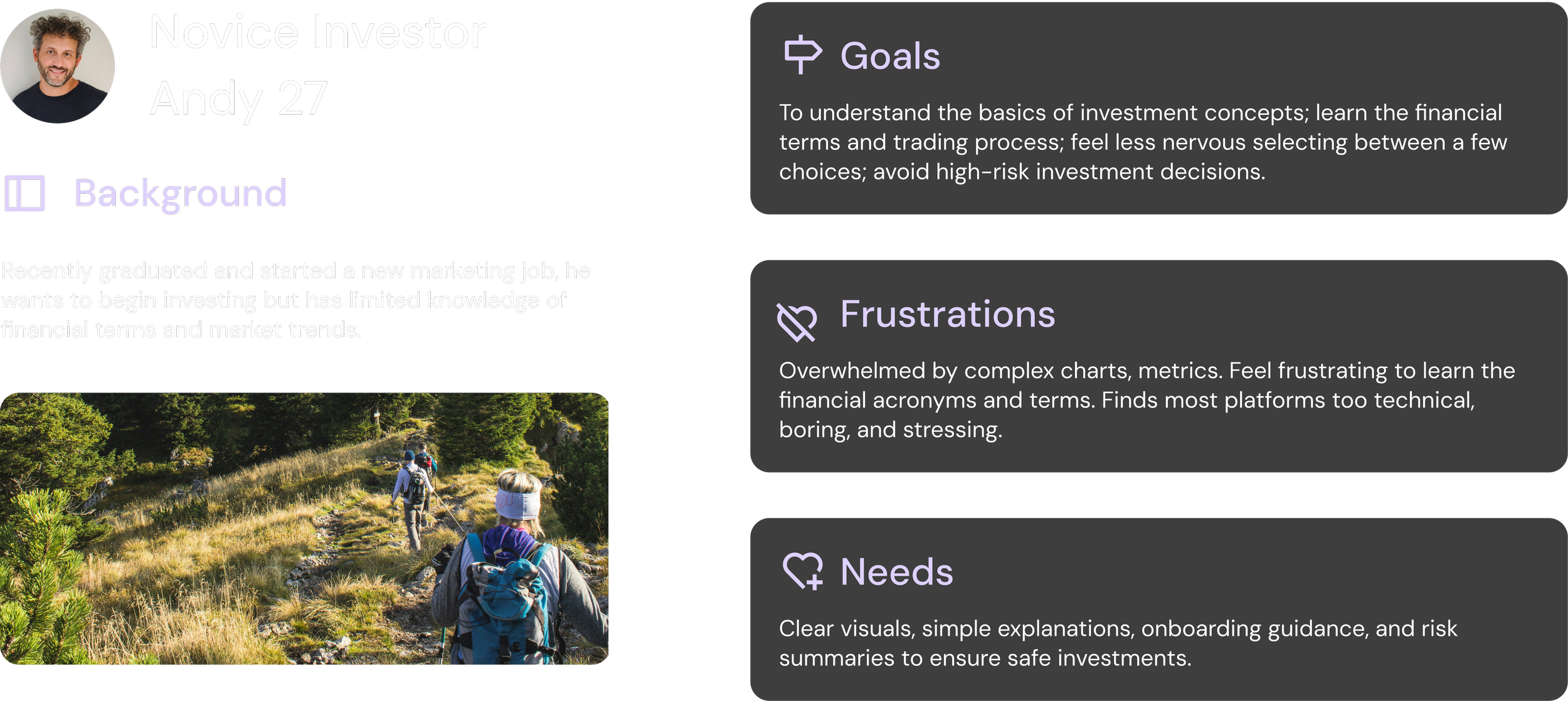
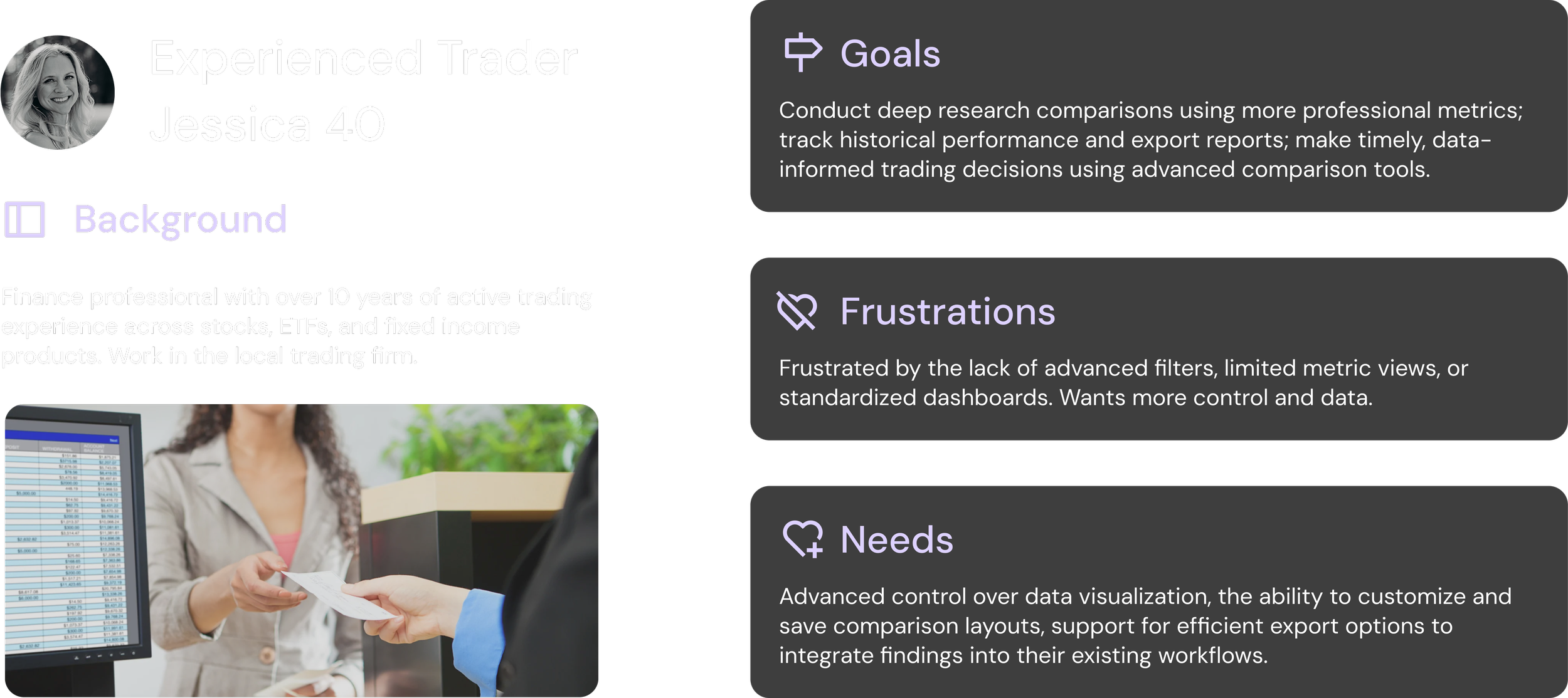
User Persona
Problems
Complex Data for Beginners
Financial analysis platforms overwhelm beginners and slow down experts.
For new users, dense terminology, complex charts, and unlimited options create cognitive overload with little guidance. For intermediate users, metrics are scattered across screens, making comparisons difficult and time-consuming. For experts, fragmented research workflows and limited customization reduce efficiency and break analytical flow.
Across experience levels, users struggle not because of a lack of data — but because data lacks structure, prioritization, and intelligent assistance.
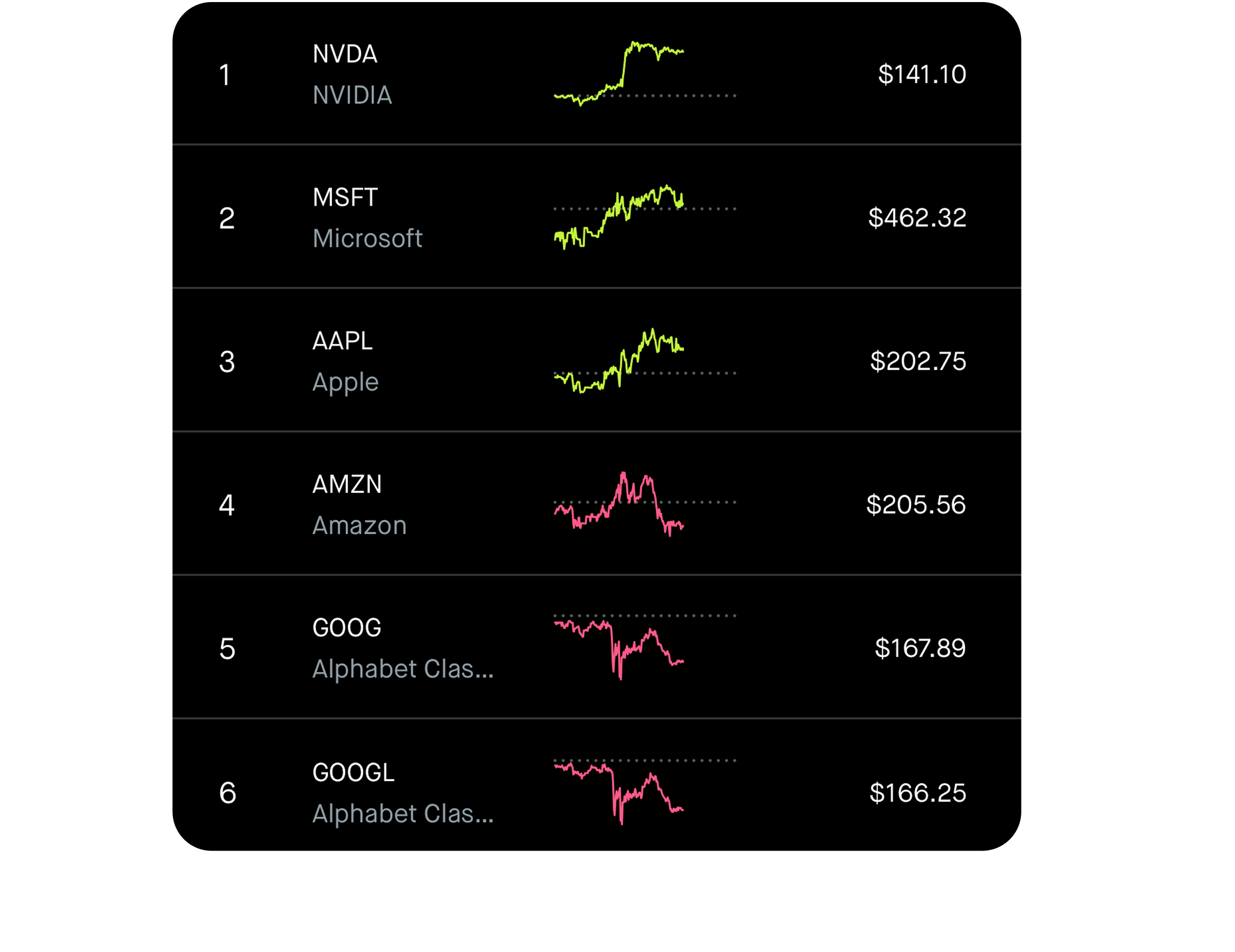
Difficult to Compare Metrics
Limited Work Efficiency for Experts
Discovery Market Research
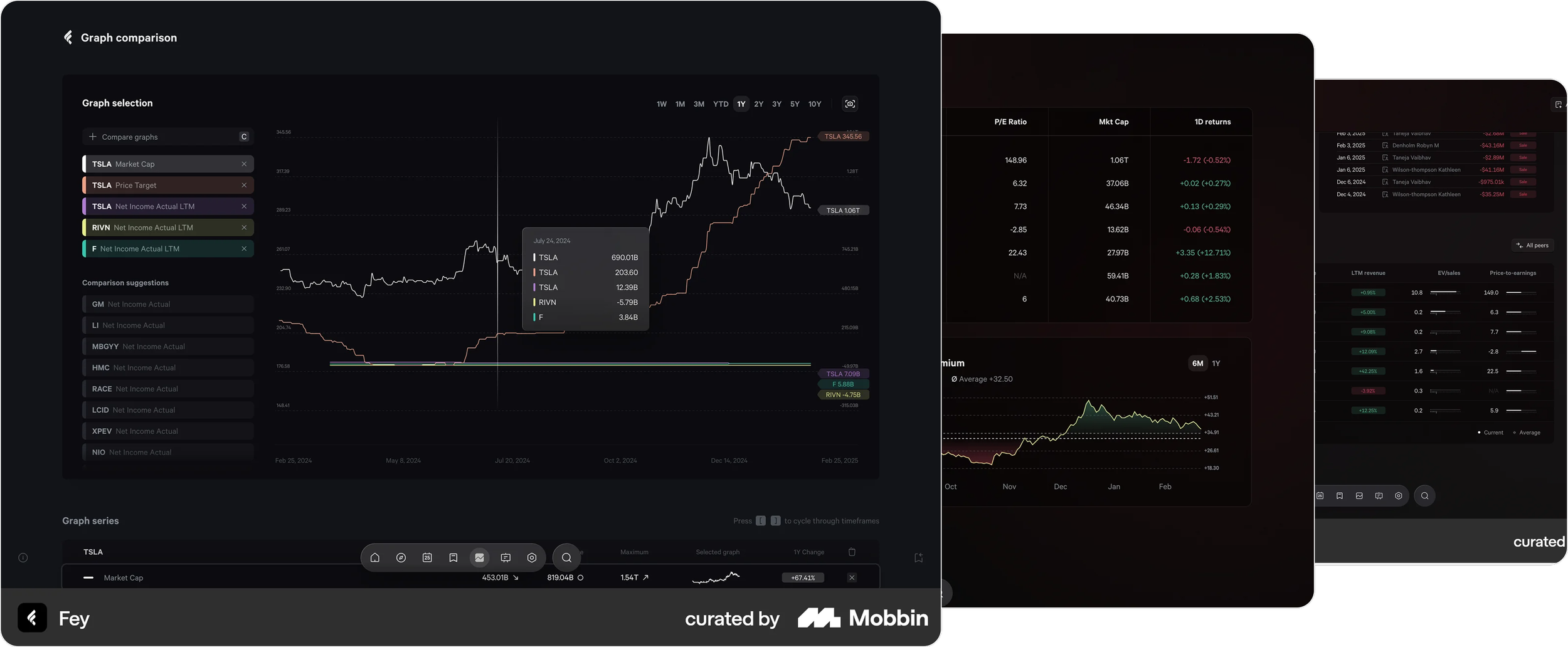
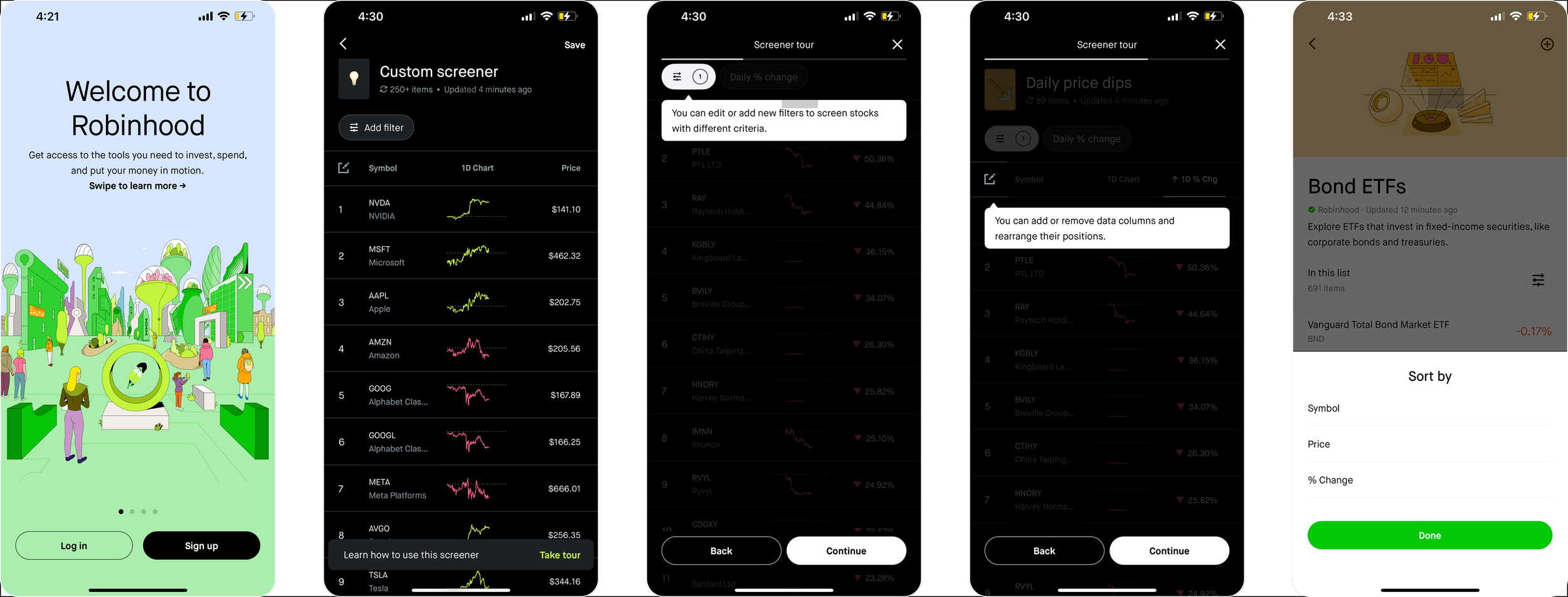
A competitor analysis review of Fey, Coinbase, and Robinhood highlights the gap my design aims to fill. Fey provides powerful multi-graph analysis. Coinbase excels at education and guided learning yet lacks deep comparison tools. Robinhood offers simple, accessible filtering but limited advanced analysis. Across all three, no product balances clarity for novices with analytical depth for experts. This informed my direction: designing a comparison dashboard that blends Fey’s analytical power, Coinbase’s learnability, and Robinhood’s simplicity into one unified workflow.
Design Solutions
Solution 1
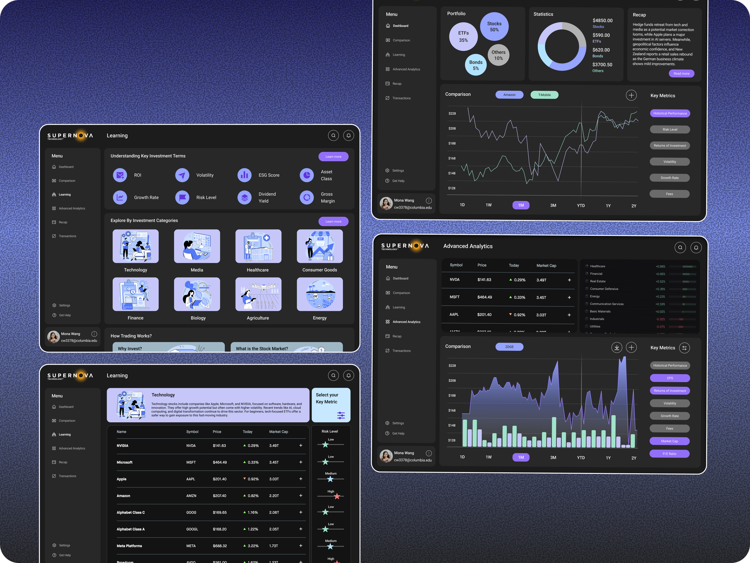
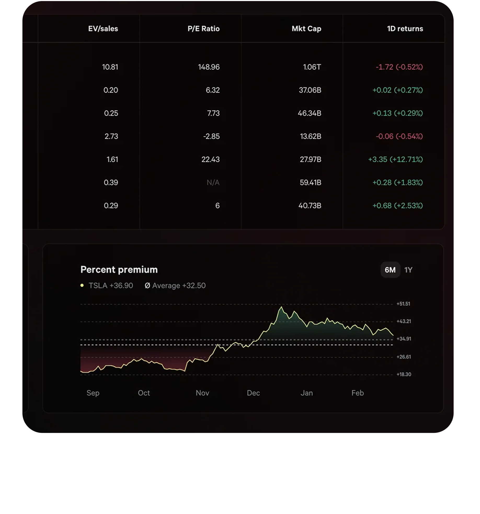
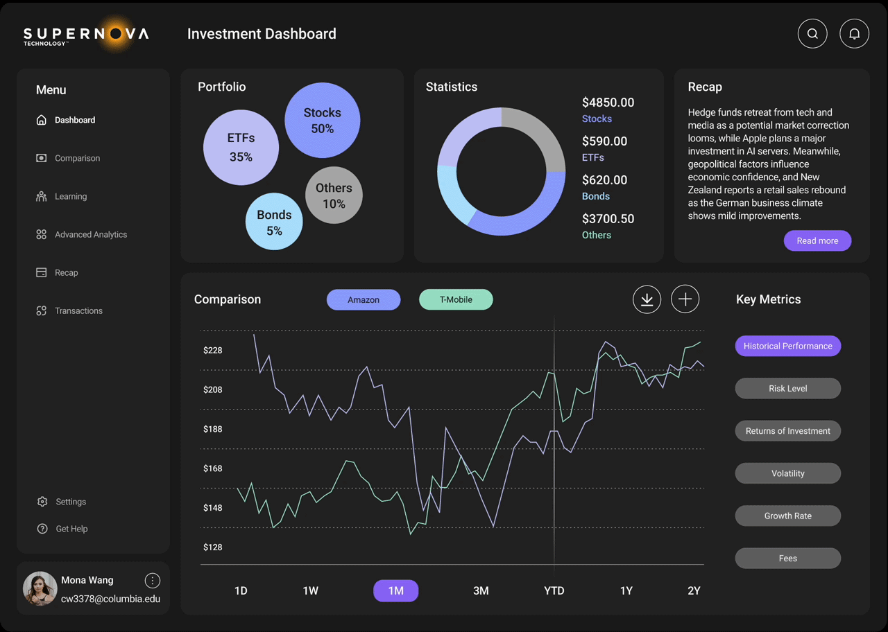
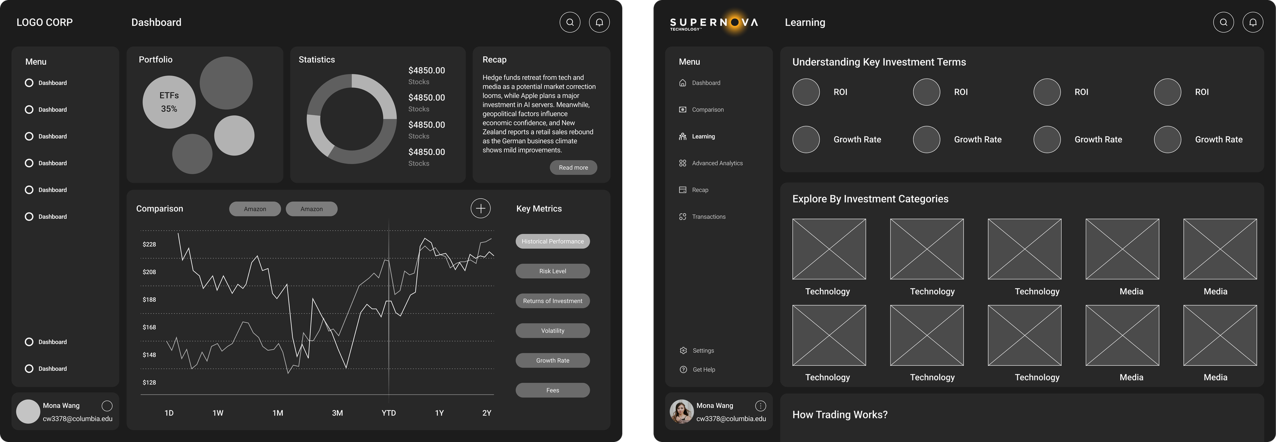
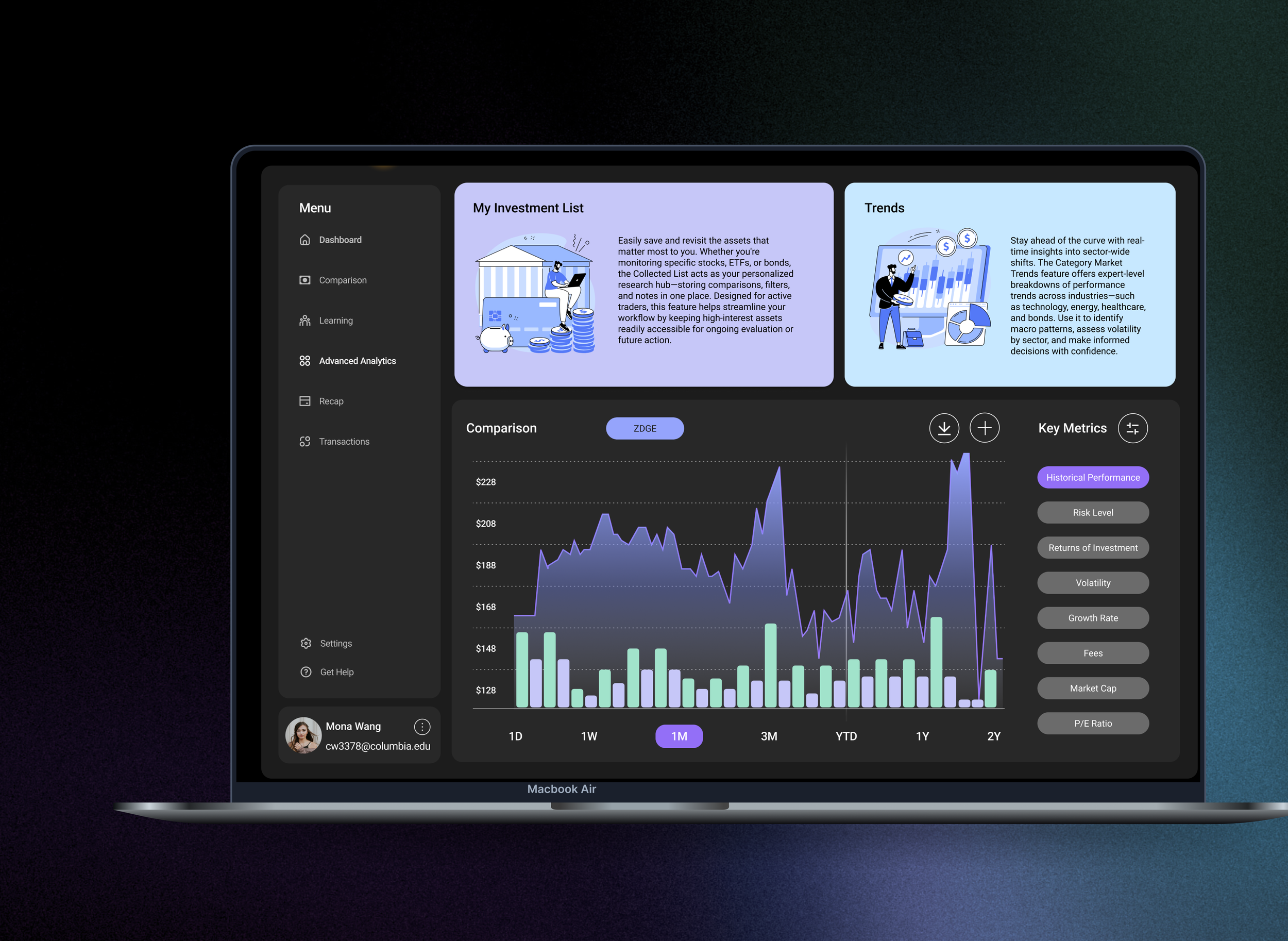
Comparing investments often becomes overwhelming due to fragmented data presentation. To address this, I designed a comparison tool that allow users to compare two investment options at one chart, enabling them to assess key metrics with clarity, whether they’re just getting started or managing multiple positions. This approach turns raw data into actionable insights based on data visualizations.
Clarify Data Visualization for Comparison
Solution 2
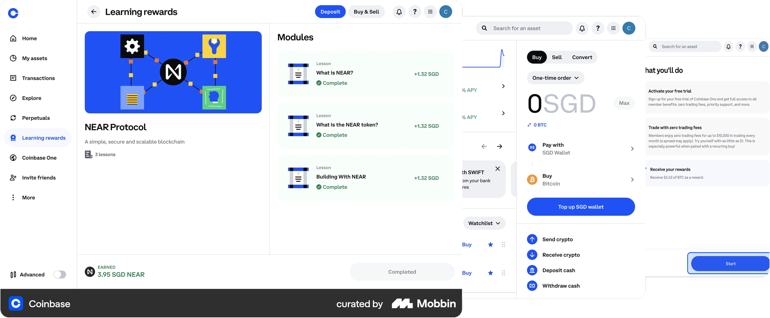
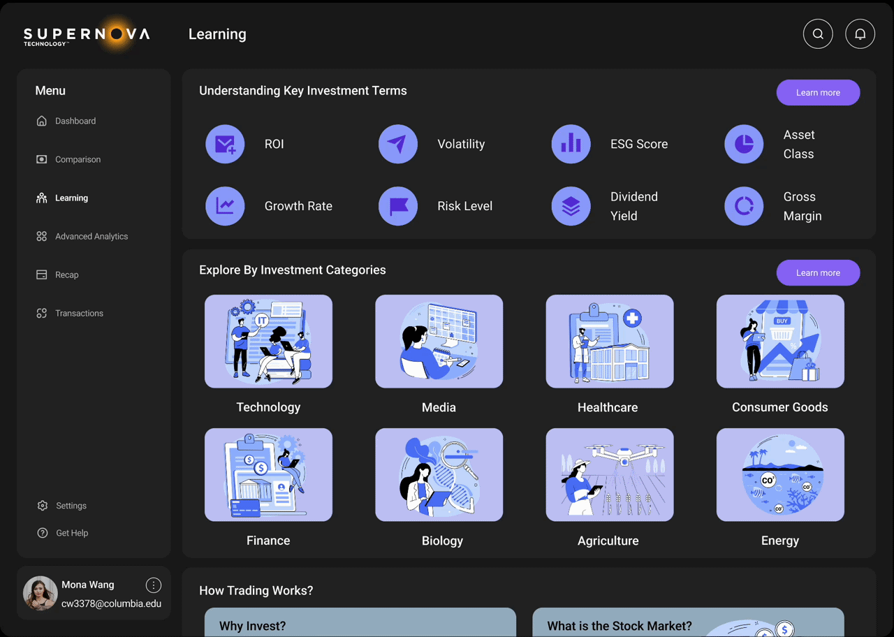
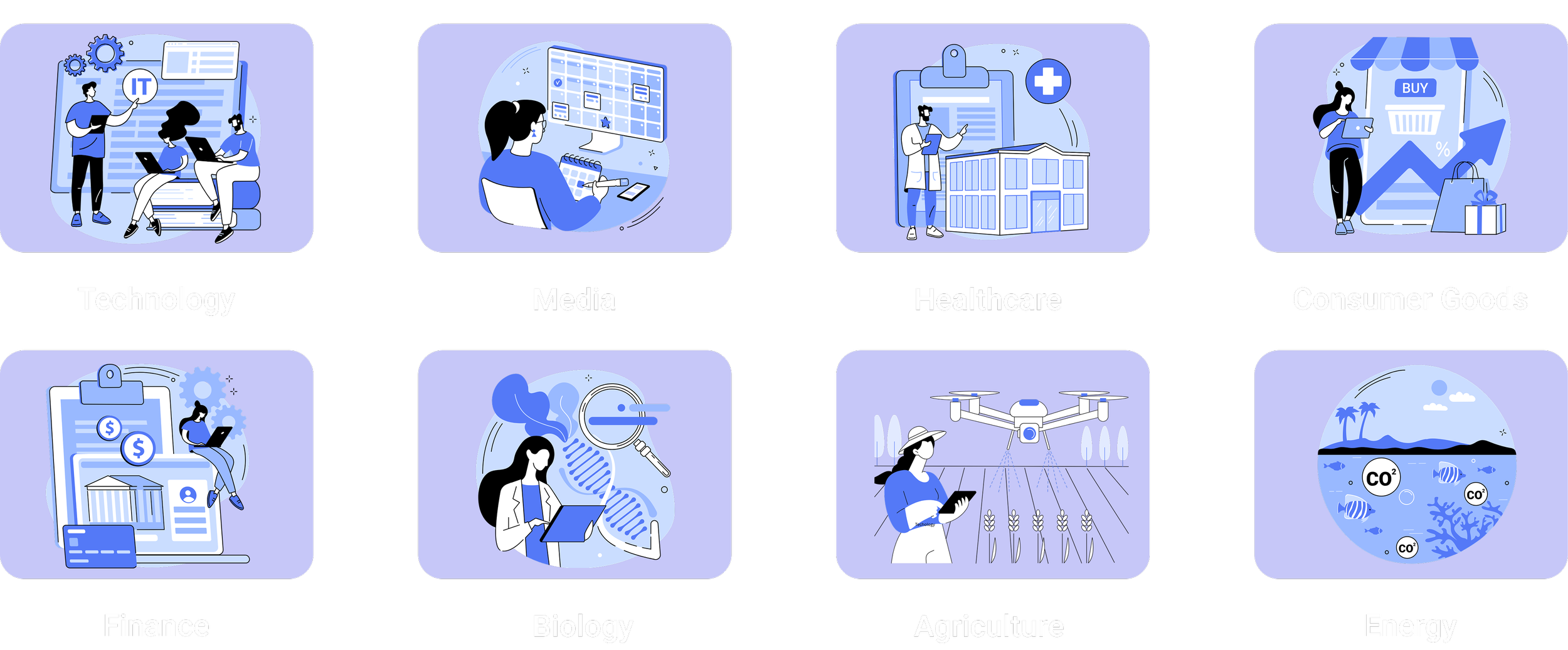
To support novice investors, I introduced a Learning feature that breaks down complex financial concepts into digestible, visual content. Users can explore key terms like ROI and volatility, browse asset categories like technology or energy, and follow step-by-step guides for making their first trade. This solution helps build confidence, allowing beginners to move from passive readers to active participants in their investment journey.
Simplify the Investment Learning Process
Solution 3
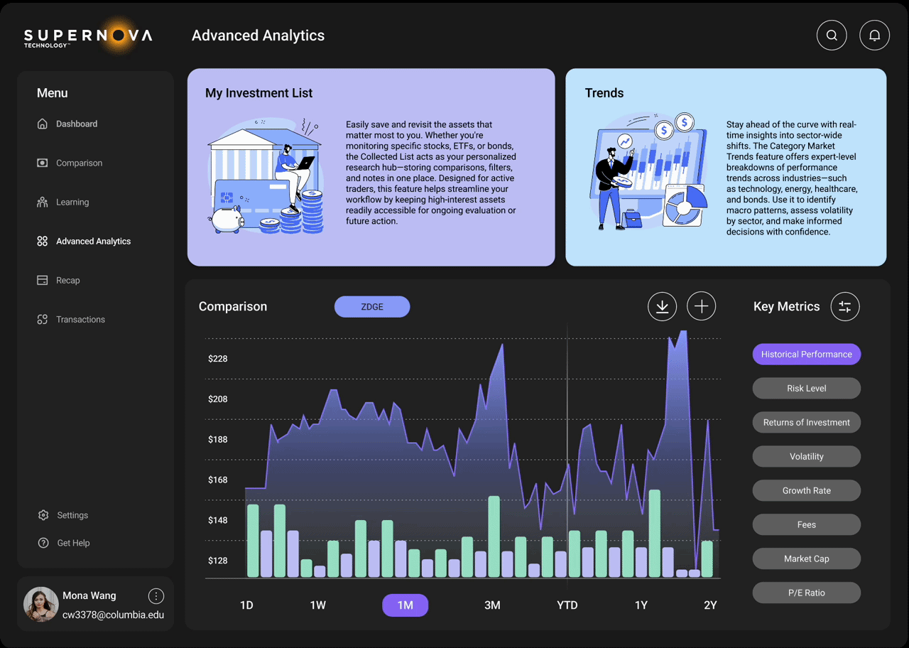
Advanced Diagram to Empower Professional Workflows
Experienced traders need flexibility, and details. To meet those needs, I designed features like My Collected List—a personalized space to save, revisit, and export selected assets—and advanced filtering tools that allow users to sort by their own metrics, asset class, or sector trends. These expert tools are built for daily portfolio monitoring, ensuring users can move seamlessly between research, comparison, and action.
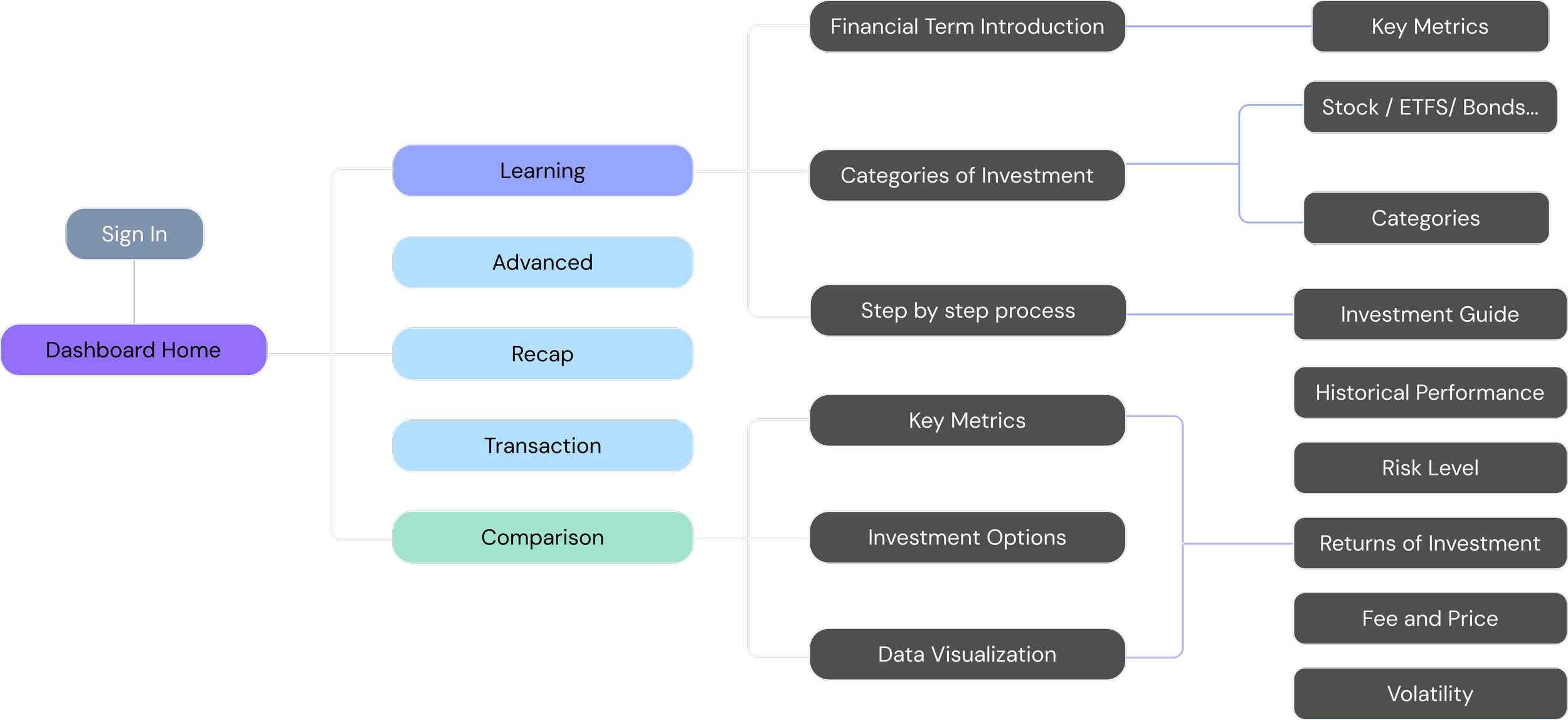
Information Architecture
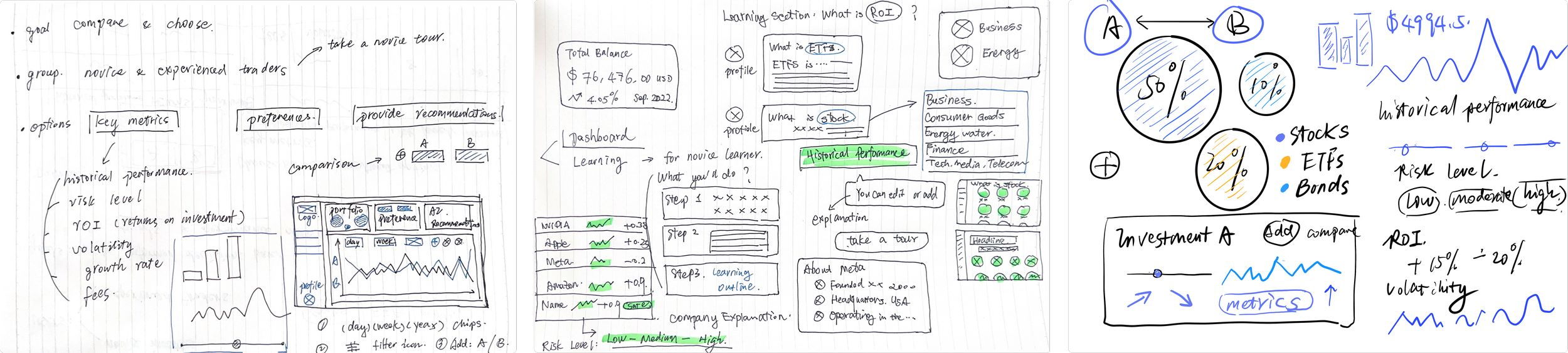
From Sketch Ideation to Wireframes
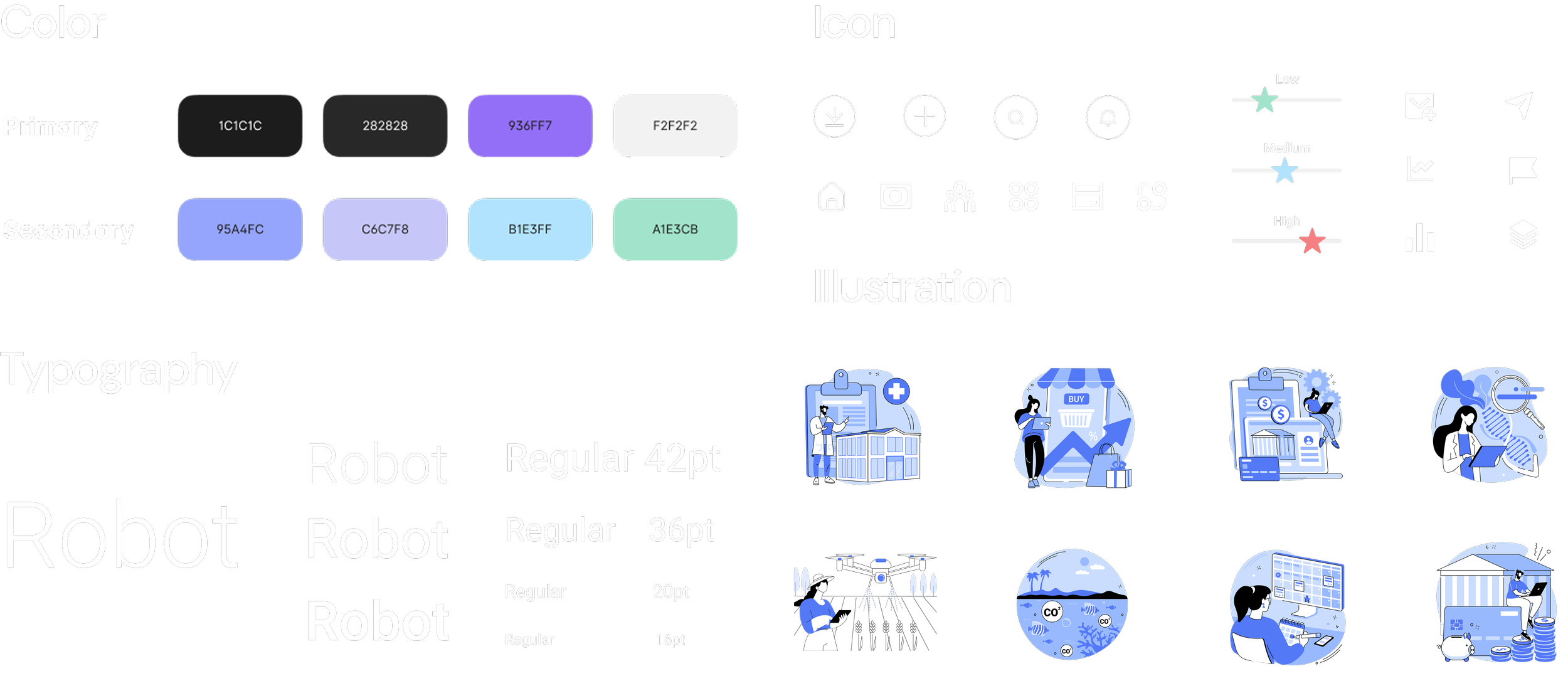
Visual Guidelines
Impact
The dashboard reduced comparison time by up to 50%, improved comprehension of risk and performance data, and increased engagement with key comparison tools. Novice users reported higher clarity while expert users achieved greater workflow efficiency. Overall usability scores and satisfaction metrics indicated significant improvements in transparency, learnability, and decision support.
+50%
Faster Work Efficiency
+80%
Improved Data Comprehension
4.9/5
Learning Engagement